
 admin
admin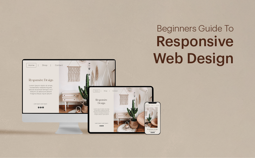
Beginner’s Guide to Responsive Web Design: Best Practices for 2025
Responsive web design (RWD) has become essential for developers in the ever-evolving landscape of web development. With an increasing number of users accessing websites on smartphones, tablets, and desktops, it’s crucial to ensure that your website offers a seamless experience on all devices. In this guide, we’ll cover the best practices for creating a responsive website in 2025.
1. Mobile-First Design Approach
- In 2025, mobile-first design is not just a best practice; it’s a necessity. Google and other search engines prioritize mobile-friendly websites, and the majority of web traffic comes from mobile devices. When designing a site, start by designing for the smallest screen size first, then progressively enhance the design as the screen size increases. This ensures that users on mobile devices have the best possible experience while also allowing your design to scale well on larger screens.
2. Fluid Grid Layouts
- Fluid grids are a key feature of responsive web design. Rather than using fixed-width layouts, fluid grids use percentages to define widths and heights. This allows elements to adjust based on the screen size. For example, a three-column layout can adjust to two or even one column depending on the available screen width. The result is a layout that dynamically adapts to different screen sizes, providing an optimal viewing experience.
3. Flexible Images and Media Queries
- Images are an essential part of any website, but their fixed size can create issues on different devices. Using CSS media queries to adjust the size of images based on the device’s screen size ensures that images don’t become too large or too small. You can also use the
srcsetattribute in HTML to specify different image sizes for different screen resolutions.
<img src="image.jpg" srcset="image-small.jpg 600w, image-medium.jpg 1200w, image-large.jpg 1800w" alt="example image">
4. Utilizing CSS Flexbox and Grid
- CSS Flexbox and Grid are powerful layout systems that simplify responsive design. Flexbox allows elements to be arranged in flexible containers, while Grid provides a two-dimensional layout system for both rows and columns. Both of these techniques can be combined with media queries to create layouts that automatically adapt to different screen sizes without complex workarounds.
Example (CSS Grid):
.container {
  display: grid;
  grid-template-columns: repeat(auto-fit, minmax(300px, 1fr));
5. Embrace Viewport Units and Rems
- Using relative units such as vw (viewport width), vh (viewport height), and rem (root em) instead of fixed pixel values will make your website more adaptable to different screen sizes. Viewport units scale based on the size of the viewport, while rems are relative to the root font size, making it easier to maintain a consistent layout across devices.
6. Test on Multiple Devices and Screen Sizes
- Testing your website on various devices and screen sizes is critical for ensuring that your responsive design works as intended. Tools like Chrome DevTools allow you to simulate different device screens, but it’s also essential to test on actual devices when possible. Don’t just test on desktop and mobile—ensure your website also works well on tablets, laptops, and different-sized monitors.
7. Prioritize Performance and Speed
- In 2025, page speed is more important than ever. A responsive design isn’t just about appearance—it’s about performance. Minimize the use of large images, reduce the number of HTTP requests, and use lazy loading for images and videos to improve load times. Optimizing the performance of your responsive website will enhance the user experience and help you rank better in search engines.
8. Typography: Readable on All Devices
- Typography plays a huge role in responsive design. Ensure your text is legible on all screen sizes by adjusting font sizes using relative units like rem or em. Additionally, consider line height, letter spacing, and text contrast to enhance readability on mobile screens. Tools like Google Fonts offer a variety of responsive font options that automatically adjust to different screen sizes.
9. Mobile-Friendly Navigation
- Navigation is a crucial part of a responsive design. For smaller screens, consider using collapsible navigation bars (like a hamburger menu) or a bottom navigation bar to optimize space. Ensure that touch targets (like buttons) are large enough to be easily tapped without errors. In 2025, users expect smooth, intuitive navigation on all devices, so make sure your site’s menu is accessible and functional on mobile.
10. Accessibility in Responsive Design
- Accessibility should always be a priority. Make sure that your responsive website is usable by people with disabilities, including those using screen readers, keyboard navigation, and voice commands. Use semantic HTML elements and ARIA (Accessible Rich Internet Applications) attributes to improve accessibility across devices. This is not only an ethical responsibility but also essential for compliance with web accessibility standards (like WCAG).
Conclusion
Responsive web design is a must-have skill for developers in 2025. By following these best practices—starting with a mobile-first approach, leveraging fluid grids and flexible images, and embracing modern layout systems like Flexbox and Grid—you can create websites that offer an optimal user experience on any device. Additionally, prioritizing performance, testing on multiple devices, and focusing on accessibility will help ensure that your site is both functional and inclusive for all users.
If you keep these principles in mind, you’ll be on your way to building highly adaptable, fast, and user-friendly websites that stand the test of time. Happy coding!